Introduction to Bubble Chart in SwiftUI [Chart Framework]
With the introduction of the Charts framework in SwiftUI, creating various types of data visualizations has become more accessible. One such visualization is the Bubble Chart, which is ideal for representing data with multiple dimensions, such as the relationship between three variables.
In a bubble chart, each bubble's position represents two variables (x and y coordinates), while the bubble's size (radius or area) represents the third variable. The use of different sizes for the bubbles adds a layer of complexity, making this chart a great choice when you need to compare data in a multi-dimensional space.
Key Components:
- Chart: The container for all chart-related views.
- BubbleMark: A specialized mark for creating bubble-like visuals.
- Scale and Axes: Define the range and display of the data for x, y axes, and the size of bubbles.
- Modifiers: Used for customizing the appearance, such as colors, sizes, and labels.


![Line Chart with SwiftUI [Chart Framework]](assets/176.jpg)
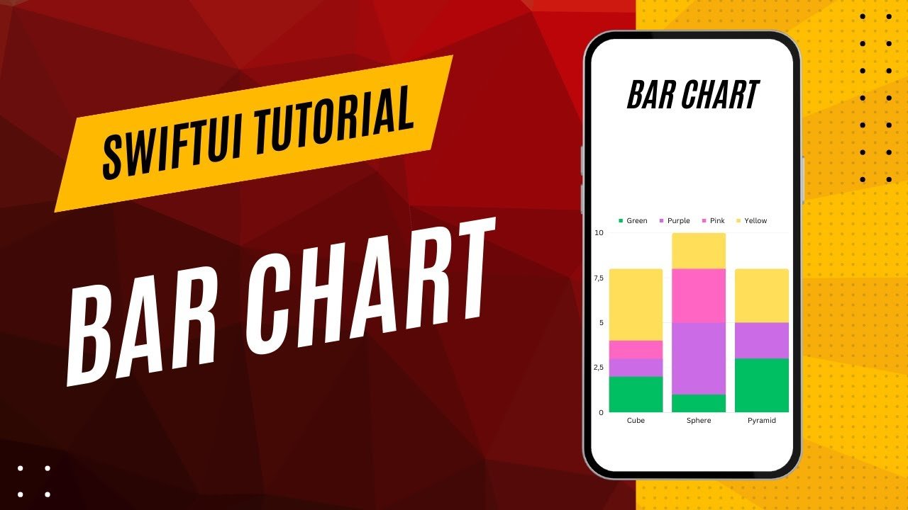
![Bar Chart with SwiftUI [Chart Framework]](assets/179.jpg)
![Pie Chart with SwiftUI [Chart Framework]](assets/180.jpg)
![Scatter Chart with SwiftUI [Chart Framework]](assets/181.jpg)