In this video, you will learn how you can create an attention-grabbing and animated button design with SwiftUI! 🚀
Platform: IOS17+
► Get Source Code:
► https://www.patreon.com/posts/moving-button-110934916
► Website:
► https://swiftuicodes.net
► X Platform
► https://x.com/swiftuicodes
► Instagram
► http://instagram.com/swiftuicodes
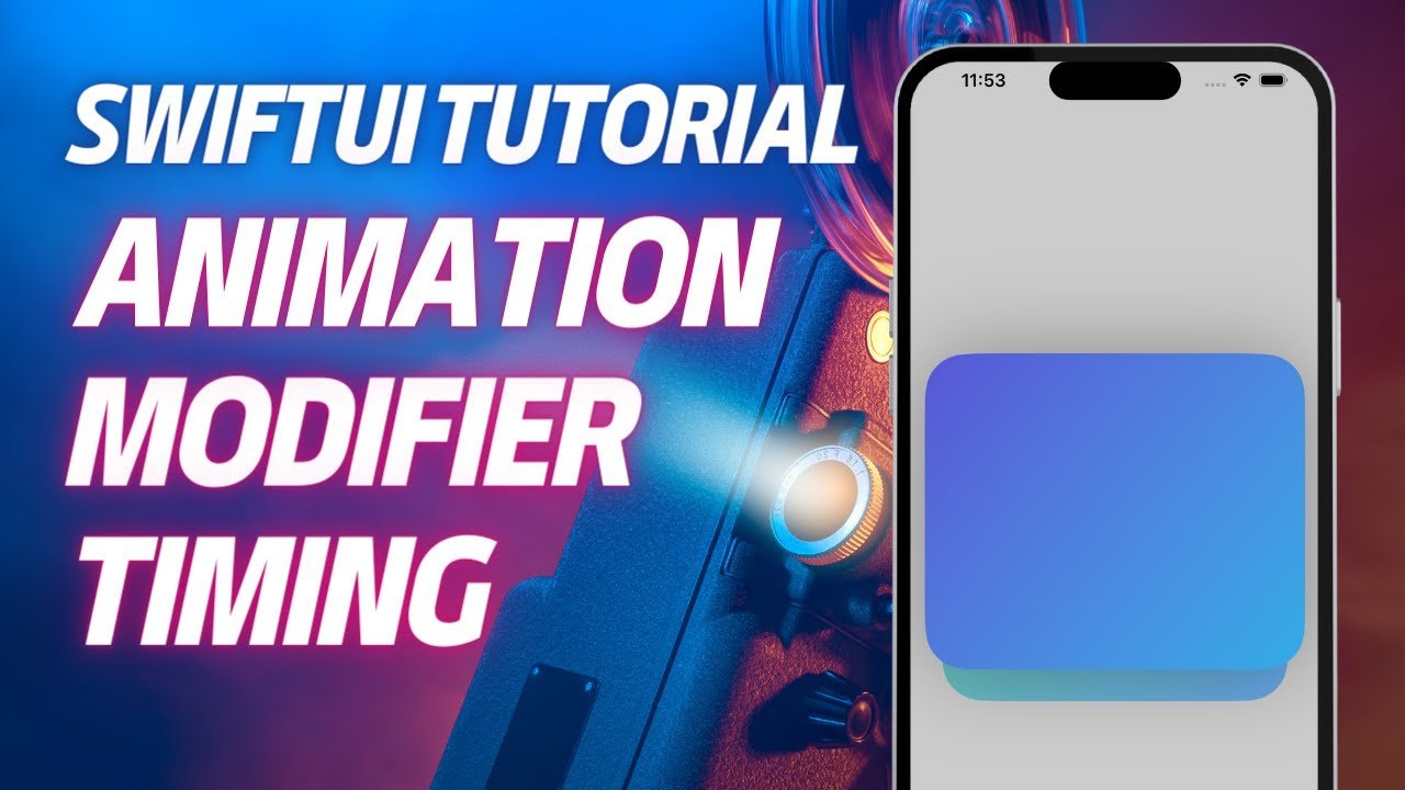
This special component called ‘MovingDashPhaseButton’ offers a moving border animation that responds to user interactions.
📚 What You Will Learn In This Video:
Create layered interfaces using ZStack in SwiftUI.
Modern and stylised button designs with RoundedRectangle.
Control animations and respond to user interactions with @State.
Bring your UI components to life with gradient colour transitions and animated borders.
🛠️ Tips for App Developers:
Discover how to make your buttons more dynamic to enhance the user experience.
Customise your animations using the withAnimation function and take your UI one step further!
ContentView Structure:
This structure is the main view and contains a custom button component called MovingDashPhaseButton.
MovingDashPhaseButton Structure:
This structure provides a button design that includes an animated border (stroke) around the button.
@State private var isMoving = false: This state variable controls the animation of the border.
ZStack: The background and border of the button component are stacked on top of each other.
RoundedRectangle:
The first RoundedRectangle forms the background of the button and is coloured with a gradient style.
The second RoundedRectangle forms the animated border and the border moves according to the button's isMoving state.
Animation: When the user presses the button, the border moves animatedly with the defined ‘dashPhase’ value.
🔔 Subscribe to our channel and turn on your notifications for more SwiftUI tutorials! If you liked this video, don't forget to comment and share.
